Raster Change analysis with Two dates: Hurricane Rita
This blog provides a simple example of change detection analysis using remotely sensed images from two dates. To measure change, we will use a vegetation index (NDVI) to examine how the vegetation and surface was affected by the hurricane.I use two images from the MODIS Terra Sensor (MOD09) to examine if the impact of Hurricane Rita is visible on the ground. Hurricane Rita was a category 3 hurricane that made landfall on September 24, 2005 in the southwest Louisiana coast. The hurricane generated a surge of more than 4 meters than resulted in flooding and in several areas along the coast.
For this example, we take an image comparison approach using pair of images rather than a time series approach. Pairwise differencing is a common simple approach to asses change when data is scarce in rapid mapping applications. I downloaded and processed MOD09 images for the date before and after hurricane Rita. The data was screened for unreliable pixels and aggregated at a 1km spatial resolution to deal with missing values. The goal of the blog is focus on the analysis for detailed explanation of the tools (e.g. raster package R) please follow links and see the reference section.
Setting up input parameters and directories
First, let us set up the input directories to read in (input directory) and store outputs (output directory). It is good practice to concentrate all the variables and input parameters at the start of the script. We also create an output directory that can change for each analysis (using output suffix as identifier).
############################################################################
#####  Parameters and argument set up ###########

#Note: https://ntrs.nasa.gov/archive/nasa/casi.ntrs.nasa.gov/20170008750.pdf
out_suffix <- "change_" #output suffix for the files and ouptut folder

in_dir <- "/home/bparmentier/c_drive/Users/bparmentier/Data/websites/data/testing_web_site"
out_dir <- "/home/bparmentier/c_drive/Users/bparmentier/Data/websites/data/testing_web_site"

file_format <- ".tif" #PARAM 4

infile_reflectance_date1 <- "mosaiced_MOD09A1_A2005265__006_reflectance_masked_RITA_reg_1km.tif" #date 1 image
infile_reflectance_date2 <- "mosaiced_MOD09A1_A2005273__006_reflectance_masked_RITA_reg_1km.tif" #date 2 image

infile_reg_outline <- "new_strata_rita_10282017.shp" #region outline and FEMA data
Reading in rasters and visualizing bands
We load in the input images. The dates closest to the hurricane event were chosen as likely to show Hurricane impact. The first date corresponds to September 22, 2005 (before event) and the second date to September 30 2005 (after event). We use a raster brick and assign the corresponding band names. Note that the bands are not ordered in the order of their spectral wavelengths in the MODIS MOD09 product so we must assign specific band names and order. MOD09 product contains seven bands spanning the optical spectrum. More information on MODIS products can be found at https://lpdaac.usgs.gov/dataset_discovery/modis/modis_products_table
If you are not familiar raster images and how to create, read in or display raster, you might want to check this link http://rspatial.org/spatial/rst/4-rasterdata.html) before continuing this blog.
###### Read in MOD09 reflectance images before and after Hurrican Rita.
r_before <- brick(file.path(in_dir,infile_reflectance_date1)) # Before RITA, Sept. 22, 2005.
r_after <- brick(file.path(in_dir,infile_reflectance_date2)) # After RITA, Sept 30, 2005.

names(r_before) <- c("Red","NIR","Blue","Green","SWIR1","SWIR2","SWIR3")
names(r_after) <- c("Red","NIR","Blue","Green","SWIR1","SWIR2","SWIR3")

plot(r_before)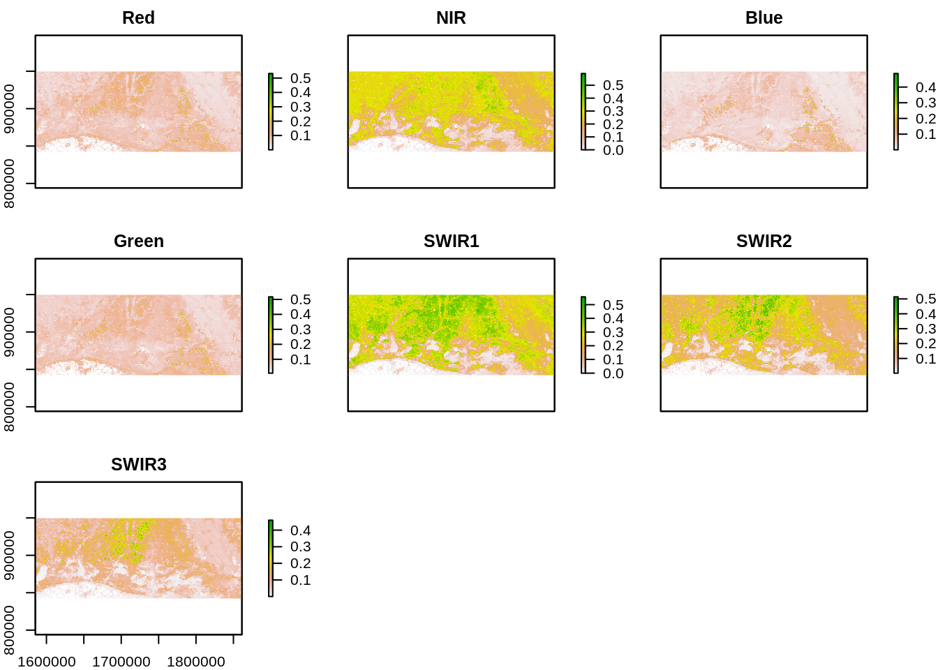
plot(r_after)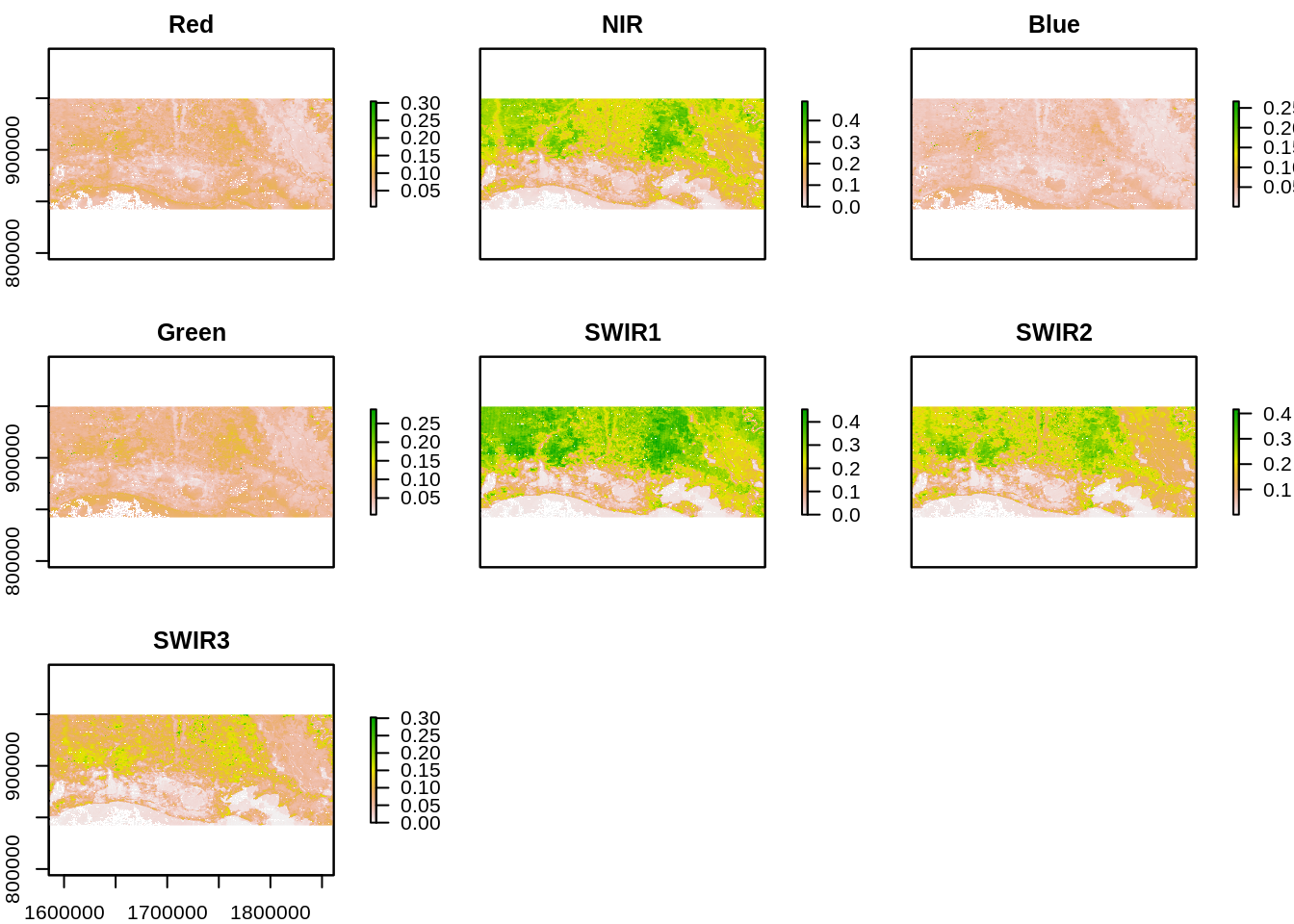
We note that Red, Near Infrared and Short Wave Infrared (SWIR1 and SWIR2) offer high contrast between vegetated areas and water. These bands also display changes in areas near the coast.
Visualization of impact using true and false color composites.
As a first step, we visually inspect for change using band combinations in a color composite. We use an RGB color compositing (raster function:plotRGB) which requires identifying spectral bands corresponding to red (band 1), green (band 4) and blue (band 1).This generates a true color composite image similar to color photography.
#### Generate Color composites
### True color composite

par(mfrow=c(2,1))

plotRGB(r_before,
        r=1,
        g=4,
        b=3,
        scale=0.6,
        stretch="hist",
        main="before")

plotRGB(r_after,
        r=1,
        g=4,
        b=3,
        scale=0.6,
        stretch="hist",
        main="after")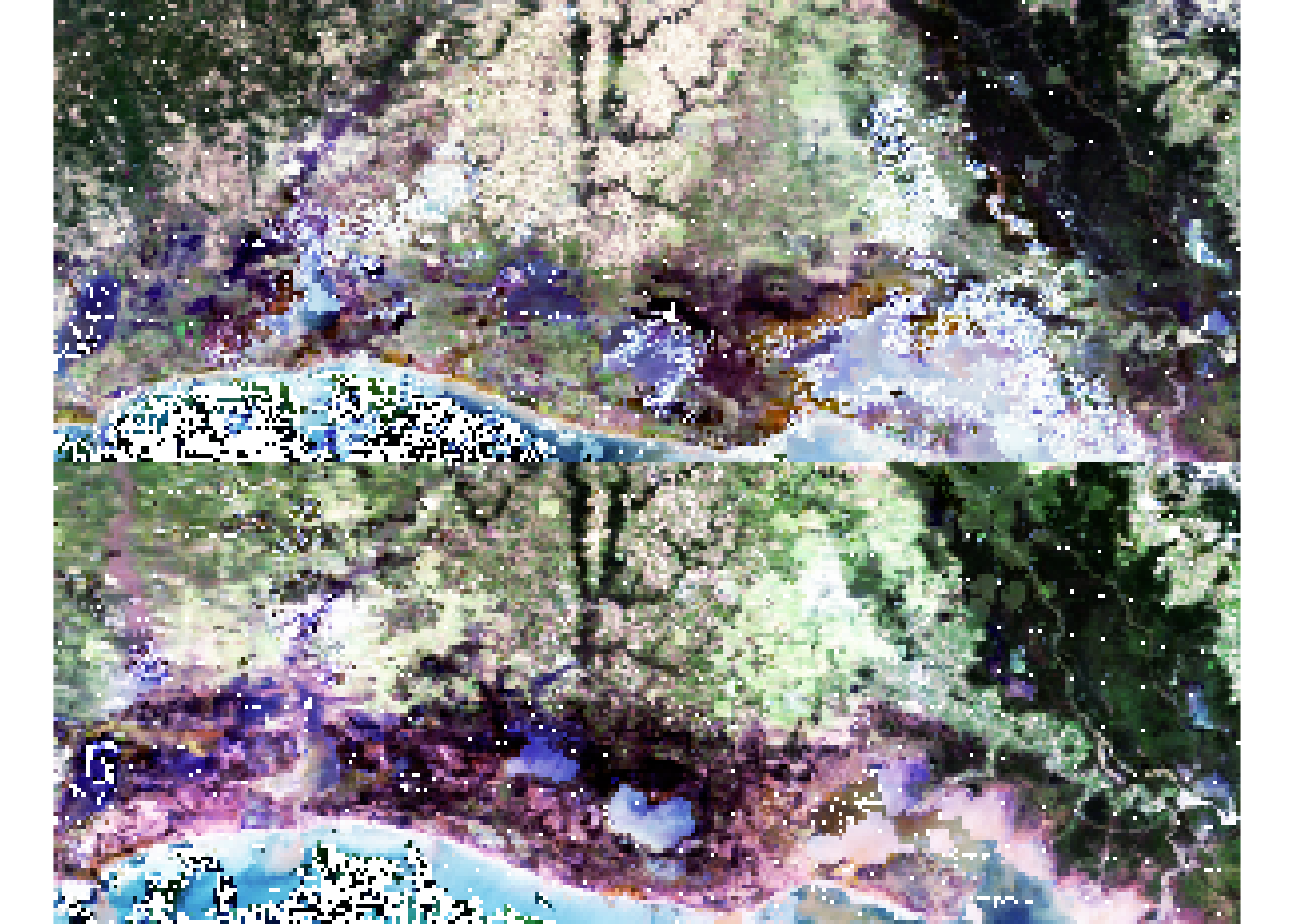
A second useful step is to generate a False color composite. This is similar to a Color Infrared (CIR) photography. We generate a RGB false composite which requires identifying spectral bands corresponding to red (band 2: SWIR), green (band 4) and blue (band 1). False Color compisites may be particularly are useful to detect vegetation and water presence on the ground.
### False color composite:
par(mfrow=c(2,1))
plotRGB(r_before,
        r=2,
        g=1,
        b=4,
        scale=0.6,
        stretch="hist")

plotRGB(r_after,
        r=2,
        g=1,
        b=4,
        scale=0.6,
        stretch="hist")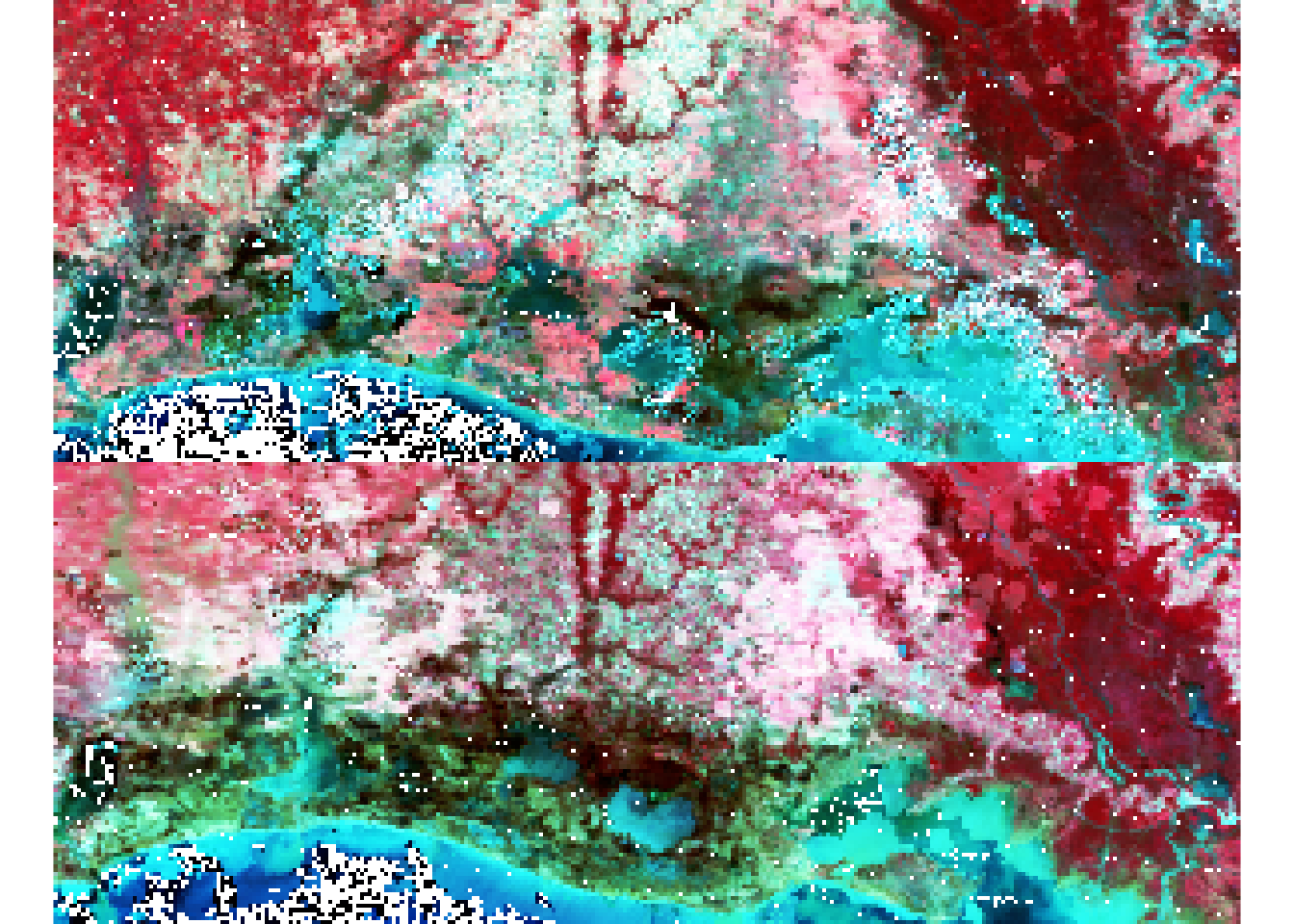
Visual inspection suggests some change areas especially visible in the false color composite towards the coast in the South East part of the study area. The next step will be to quantitavely assess where changes occur. We will use specific spectral bands combinations (indices) to focus on specific features from the ground.
Generating Indices from the original bands: NDVI
We use the original bands from MOD09 product to generate NDVI indices to detect changes in vegetation response. Indices are derived for both before and after the hurricane. NDVI is generated using the Red and Near Infrared (NIR) bands:
NDVI = (NIR - Red)/(NIR+Red)
NDVI is widely used to detect vegetation on the ground and sometimes to examine the impact of hurricanes on local forest and flooding. We generated indices for both dates and plot maps on the same scale using the levelplot function from RasterVis.
names(r_before)
## [1] "Red"   "NIR"   "Blue"  "Green" "SWIR1" "SWIR2" "SWIR3"
r_before_NDVI <- (r_before$NIR - r_before$Red) / (r_before$NIR + r_before$Red)
r_after_NDVI <- (r_after$NIR - r_after$Red)/(r_after$NIR + r_after$Red)

r_NDVI_s <- stack(r_before_NDVI,r_after_NDVI)
names_panel <- c("NDVI Before Event","NDVI After Event")
levelplot(r_NDVI_s,
          names.attr = names_panel,
          col.regions=rev(terrain.colors(255)))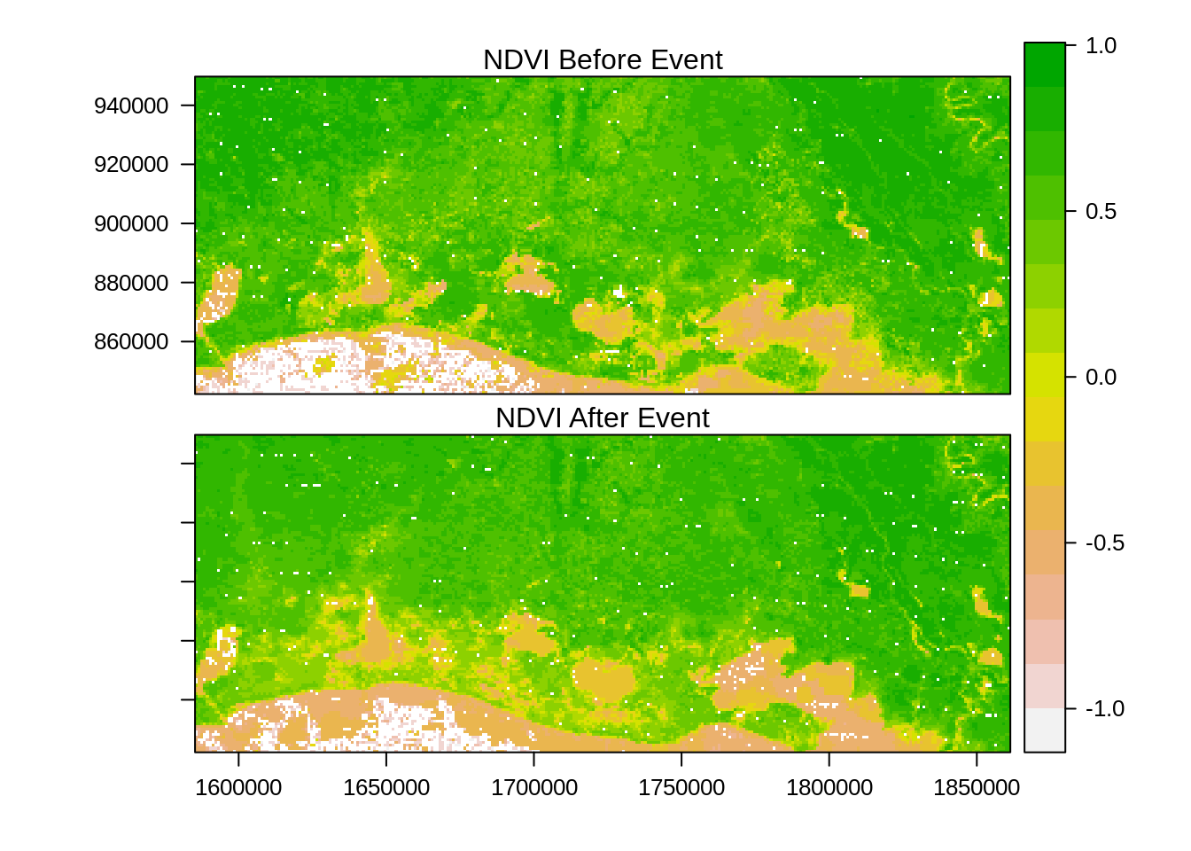
Comparison of before and after NDVI images suggests a general drop in NDVI for the region with some additional pockets of water near the coast. This visual comparison is interesting but let us check with data from Federal Emergency Management Agency (FEMA) that mapped the area flooded by Rita. We use a vector file with zone=1 representing flooding and zone=0 no flooding. This is rasterized to produce a boxplot of the averages by zones.
reg_sf <- st_read(file.path(in_dir,infile_reg_outline))
## Reading layer `new_strata_rita_10282017' from data source `/home/bparmentier/c_drive/Users/bparmentier/Data/websites/data/testing_web_site/new_strata_rita_10282017.shp' using driver `ESRI Shapefile'
## Simple feature collection with 2 features and 17 fields
## geometry type:  MULTIPOLYGON
## dimension:      XY
## bbox:           xmin: -93.92921 ymin: 29.47236 xmax: -91.0826 ymax: 30.49052
## epsg (SRID):    4269
## proj4string:    +proj=longlat +datum=NAD83 +no_defs
reg_sf <- st_transform(reg_sf,
                       crs=projection(r_after_NDVI))
reg_sp <-as(reg_sf, "Spatial") #Convert to sp object before rasterization
reg_sp <- as(reg_sf,"Spatial")
r_ref <- rasterize(reg_sp,
                   r_after_NDVI,
                   field="OBJECTID_3",
                   fun="min")

plot(r_ref, "FEMA Flood Zones")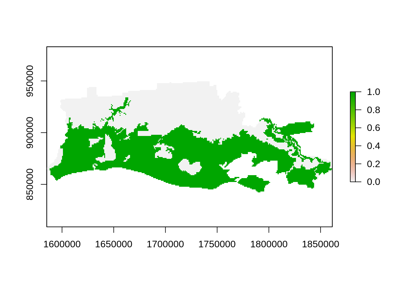
r_NDVI_s <- mask(r_NDVI_s,r_ref)
r_NDVI_s <- stack(r_NDVI_s,r_ref)
names(r_NDVI_s) <- c("before","after","zone")
ncell(r_NDVI_s) #Ok not too big, let's coerce the raster into data.frame
## [1] 34568

## Be careful when using large datasets.
##This is not advisable for large dataset to convert from raster to data.frame
#since it loads everything in memory!!

data_df <- na.omit(as.data.frame(r_NDVI_s))

zonal_var_df <- gather_(data_df,key="variable",value="value",names(r_NDVI_s)[1:2])
zonal_var_df$zone <- factor(zonal_var_df$zone,labels=c("Not flooded","Flooded"))

### Classic boxplot
bp <- ggplot(zonal_var_df, aes(x=variable, y=value)) +
  geom_boxplot(aes(fill=zone),na.rm=T)

bp + facet_wrap(~zone) #Generate a faceted boxplot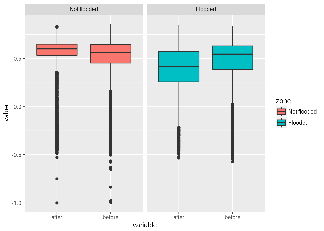
Using FEMA data, we found that on average, NDVI dropped by 0.1 in areas that were flooded while other areas displayed a slight increase. We also see that there is larger variance in flooded areas. In many cases, we do not have ancillary information on the areas flooded and we need to generate those from the original satellite images. We present below such analysis using a difference image and a reclassification procedure to map areas into impact classes.
First, let’s generate a difference image using NDVI before and after the hurricane event:
r_diff <- r_NDVI_s$after - r_NDVI_s$before

plot(r_diff)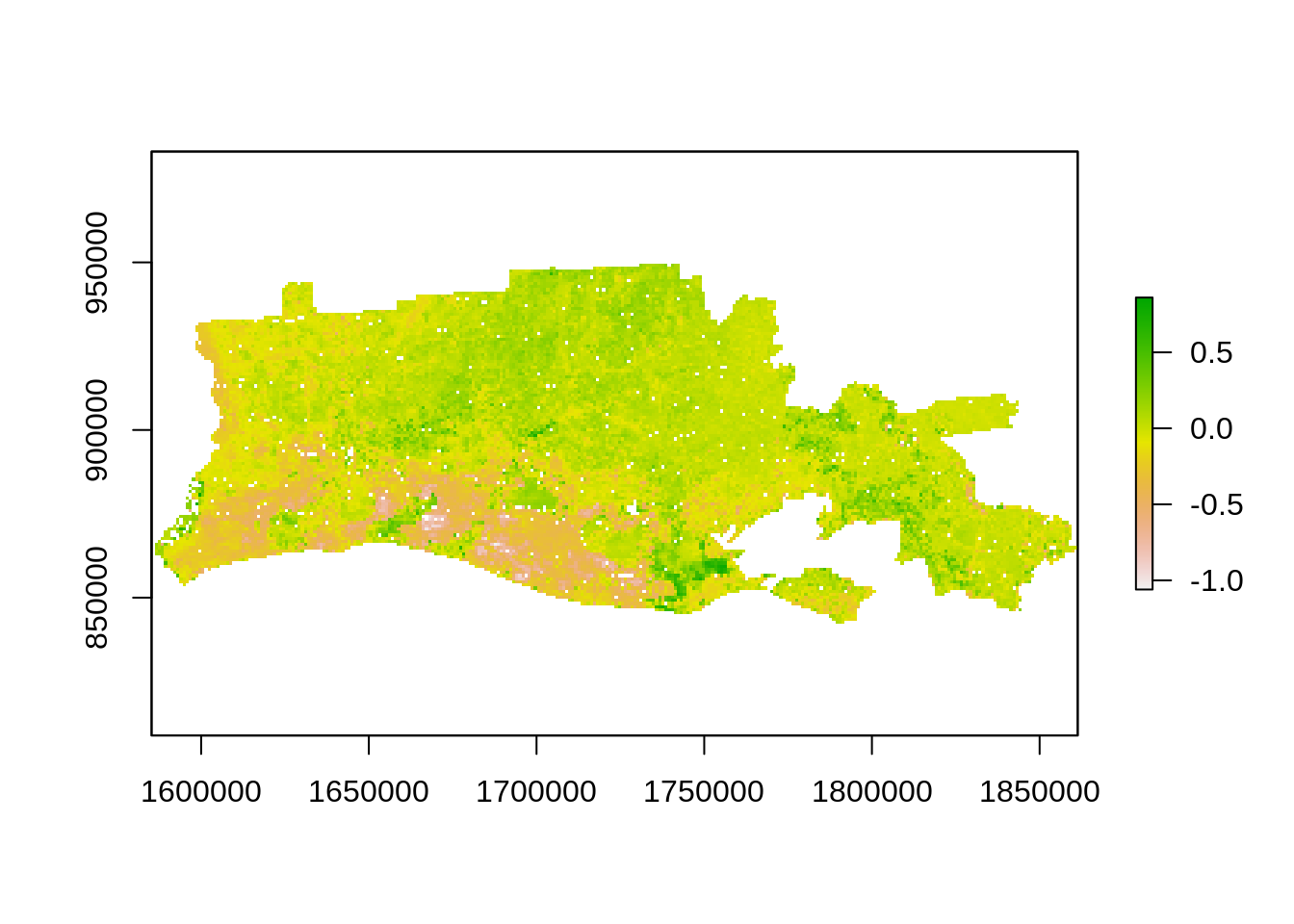
histogram(r_diff)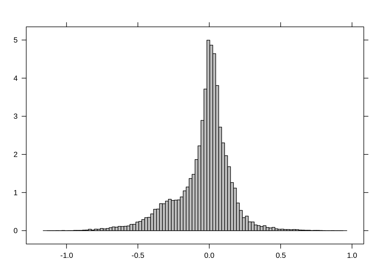
Classifying differences in impact/damage classes
We will use a method often used in the scientific literature using a standardized difference image. We generate mean and standard deviation for the difference raster and reclassify the standardized difference image using thresholds assuming a normal distribution. The limits of classes are summarized in the table below:
| label | Threshold min | Threshold max | value |
|---|---|---|---|
| no change | -1.64 | 10 | 0 |
| low impact | -1.96 | -1.64 | 1 |
| high impact | -10 | -1.96 | 2 |
mean_val <- cellStats(r_diff,"mean")
std_val <- cellStats(r_diff,"sd")

r_std <- (r_diff - mean_val)/std_val # standardized image

threshold_val <- c(1.96,1.64)
plot(r_std)
hist(r_std,
    main="Standardized difference",
    xlab="NDVI difference")
abline(v=threshold_val[1],col="red",lty=1)
abline(v=-threshold_val[1],col="red",lty=1)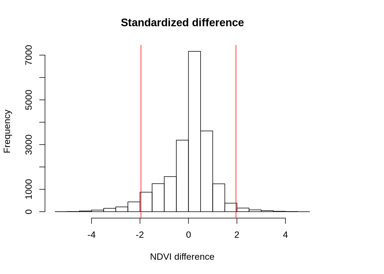
m <- c(-1.64, 10, 0,
       -1.96, -1.64, 1,
       -10, -1.96,2)

rclmat <- matrix(m, ncol=3, byrow=TRUE)

r_impact1 <- reclassify(r_std,rclmat)
freq(r_ref)
##      value count
## [1,]     0  9849
## [2,]     1 11064
## [3,]    NA 13655
freq(r_impact1)
##      value count
## [1,]     0 19061
## [2,]     1   510
## [3,]     2   968
## [4,]    NA 14029
Let’s now visualize the output and compute the area for each category. Results indicate that few pixels are selected as highly impacted. This suggests that we may be underestimating the flooded area.
Options may be to change: the threshold value to 1 standard deviation or use different procedure to reclassify the original difference image. A quick qqplot suggests that our assumption that the data follows a normal distribution is probably unwise. We also note the shoulder in the histogram of distribution and the qqplot. We will use simple thresholding and reclassification to generate another impact map.
qqnorm(values(r_std))
abline(0, 1)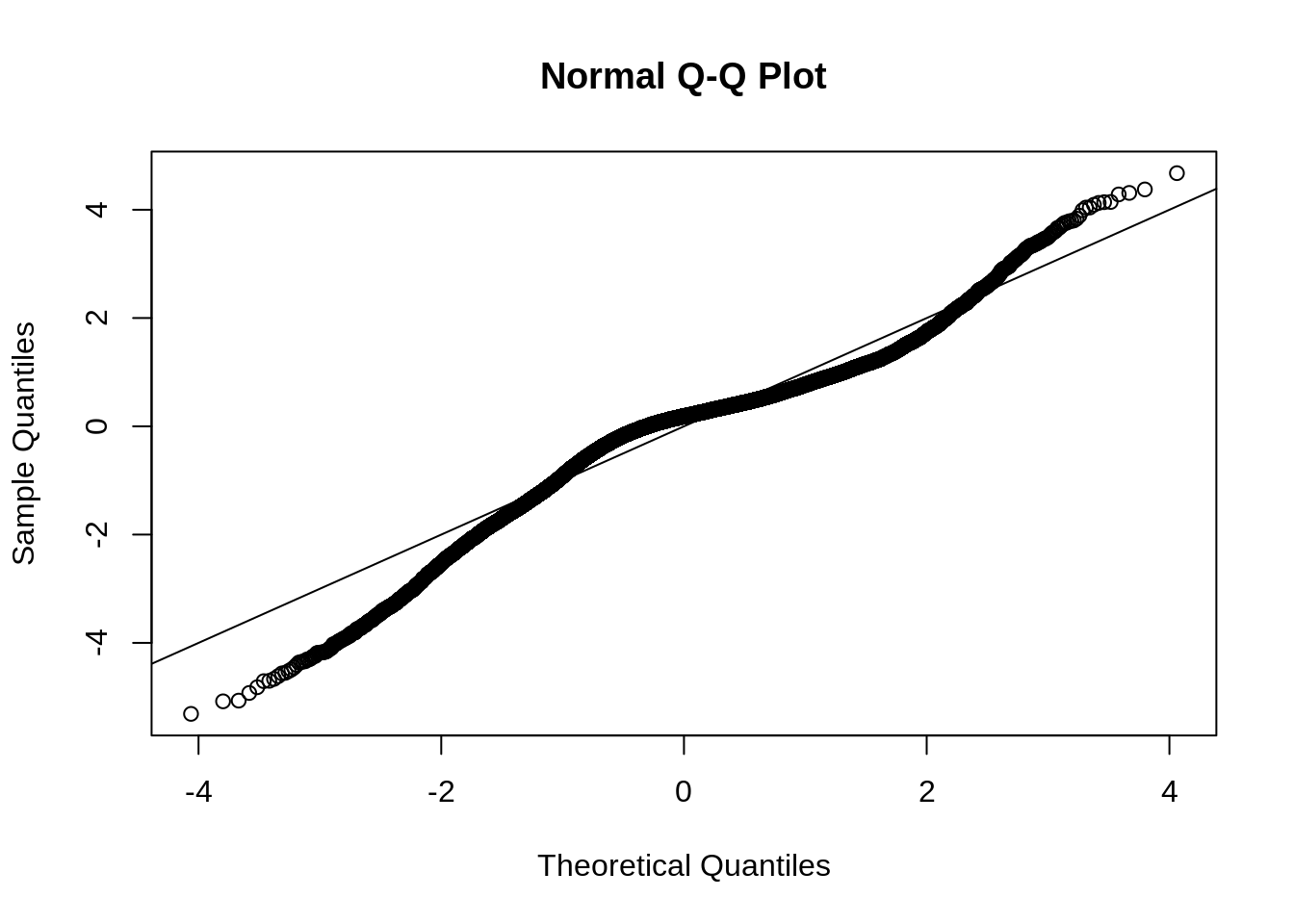
In the second procedure, we assign positive and low decreases in NDVI value 0 (no change), level 1 decrease in NDVI (low impact) for range [-0.3,0.1] while level 2 decrease (higher impact from higher intensity).
| label | Threshold min | Threshold max | value |
|---|---|---|---|
| no change | -0.1 | 10 | 0 |
| low impact | -0.3 | -0.1 | 1 |
| high impact | -10 | -0.3 | 2 |
We keep the same labels in the second procedure but use different thresholds.
m <- c(-0.1, 10, 0,
       -0.3, -0.1, 1,
       -10, -0.3, 2)
rclmat <- matrix(m, ncol=3, byrow=TRUE)

r_impact2 <- reclassify(r_diff,rclmat)

freq(r_impact2)
##      value count
## [1,]     0 15087
## [2,]     1  3338
## [3,]     2  2114
## [4,]    NA 14029

legend_val <- c("No change", "level 1", "level 2")
col_val <-  c("grey","yellow","red")

plot(r_impact1,
     main="Hurricane impact with classification method 1",
     col = col_val,
     axes=F,
     legend=F)

legend('topright',
       legend = legend_val ,
       pt.cex=0.8,cex=0.8,
       fill=col_val,
bty="n") 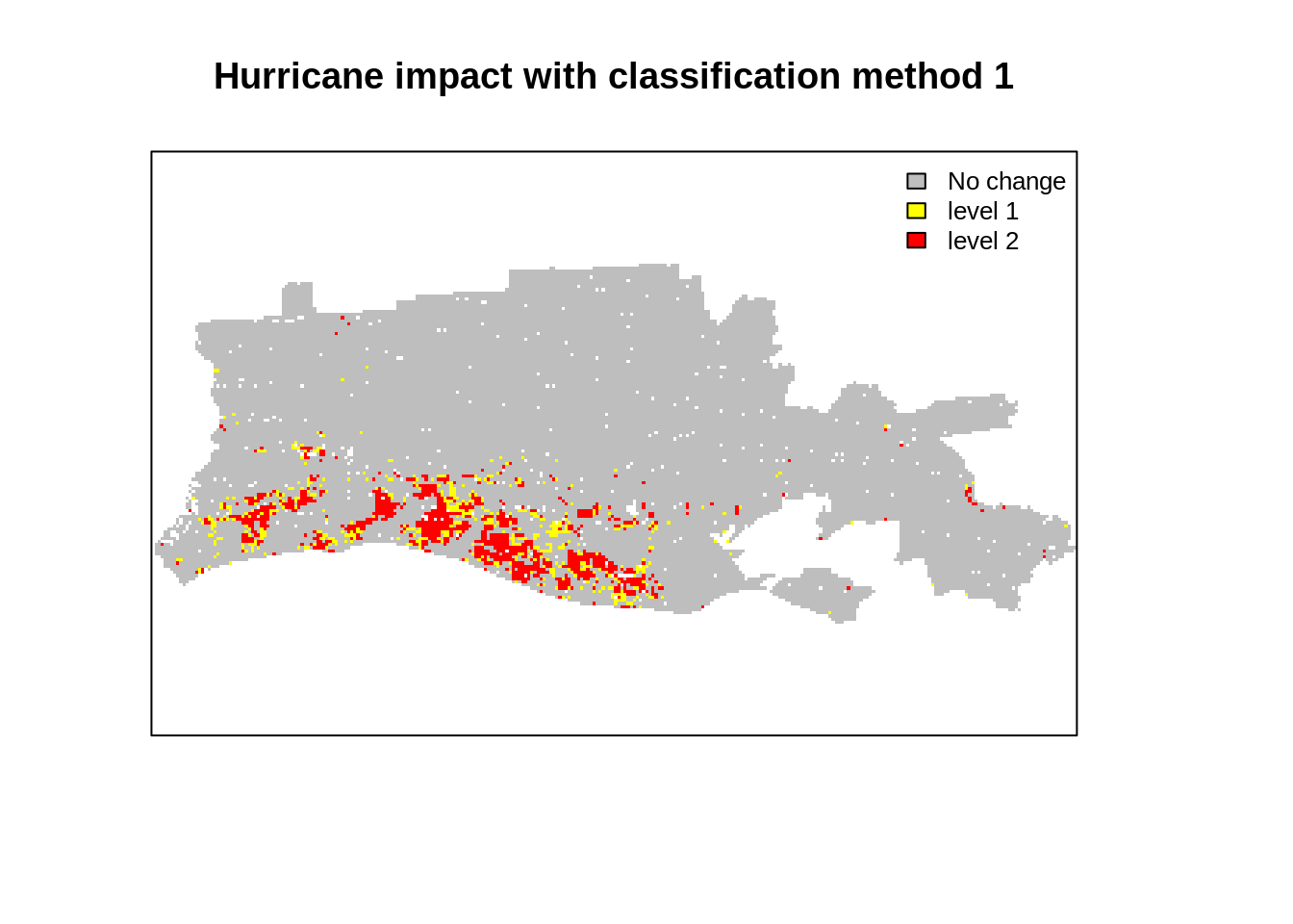
plot(r_impact2,
     main="Hurricane impact with classification method 2",
     col = col_val,
     axes=F,
     legend=F)

legend('topright',
       legend = legend_val ,
       pt.cex=0.8,cex=0.8,
       fill=col_val,
bty="n") 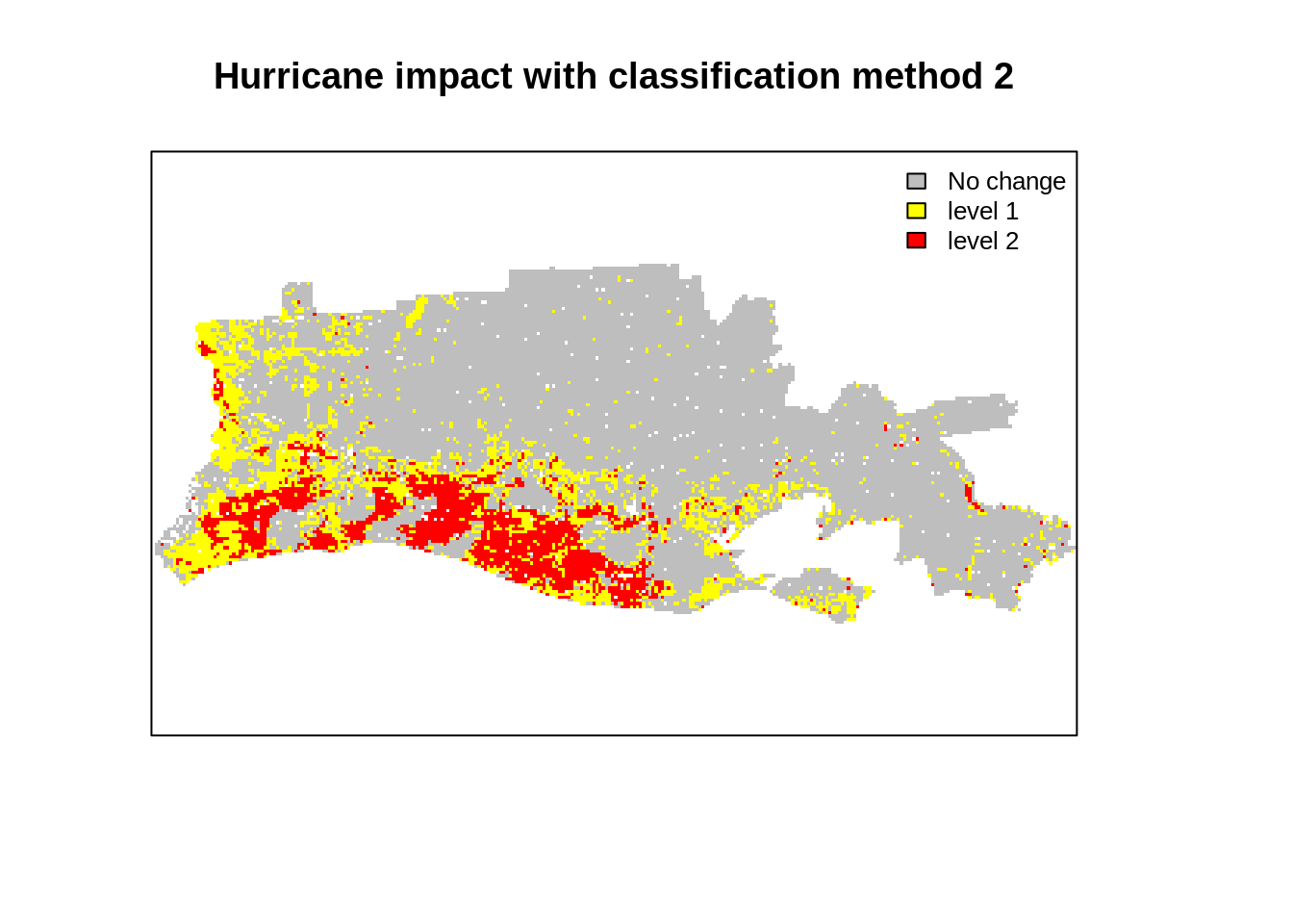
#Save the output image of hurrican impact:

out_rastname <- paste0("ndvi_impact_method1",out_suffix,file_format)
writeRaster(r_impact1,
            filename = file.path(out_dir,out_rastname),
            overwrite=T)
out_rastname <- paste0("ndvi_impact_method2",out_suffix,file_format)
writeRaster(r_impact2,
            filename = file.path(out_dir,out_rastname),
            overwrite=T)
Conclusions
This blog introduced a simple change detection analysis using MOD09 product aggregated at 1km resolution. We used two MODIS sensor images captured before and after hurrican Rita on the coast of Louisiana. Visual inspection showed evidence of changes (both in indivdiual bands and color composites). We also found that we are able to find quantitative changes, most notably a decrease in average NDVI in flooded areas. We used two common thresholding techniques used by researchers to classify the impact from a difference image (after-before) and found some matching with the FEMA flood map but with underestimation. The analysis is simple and straightforward but could be refined by using different thresholding and accounting for the vegetation and flood seasonality in the data. This would lead to more advanced topic: time series analysis of raster images. This may be a topic for a new blog!
References
- For a general introduction to spatial data: http://rspatial.org/spatial/rst/1-introduction.html
- For Geosptial teaching material from the National Socio-Environmental Center: http://cyberhelp.sesync.org/syllabi/2018/04/02/geospatial-workshop.html
- For an example of a research study on hurricane impact: Hurricane disturbance mapping using MODIS EVI data in the southeastern Yucatán, Mexico John Rogan , Laura Schneider , Zachary Christman , Marco Millones , Deborah Lawrence & Birgit Schmook Pages 259-267 | Received 12 Jun 2010, Accepted 28 Aug 2010, Published online: 29 Oct 2010 Download citation https://doi.org/10.1080/01431161.2010.520344